5.1 KiB
Checking outlines after extrapolation
It was necessary to extrapolate a Light master to allow Fira Code to build via FontMake. As a result, some outline errors may have made their way into the glyphs in this new Master, because extrapolation is a useful but imperfect tool.
For the most part, I will abstain from fixing every little outline issue, because by and large, things here are well-drawn, and haven't been extrapolated in too extreme a manner.
General Process
I will use the Glyphs App extension Red Arrows to find potential problems, then check them over and fix what seems to be clearly wrong.
If it is not super obvious how to fix a potential issue, I will generally:
- Check what the Bold master does
- Check what Fira Mono (the ancestor of Fira Code) does in its Regular master
- Copy the existing layer to the background, and make that copied layer visible to provide a basic guide for my changes. For example:

I am not trying to change the design, but rather, to fix unintended vector issues that make the design less useful.
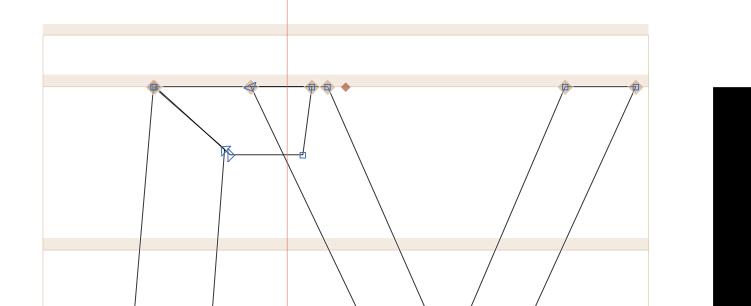
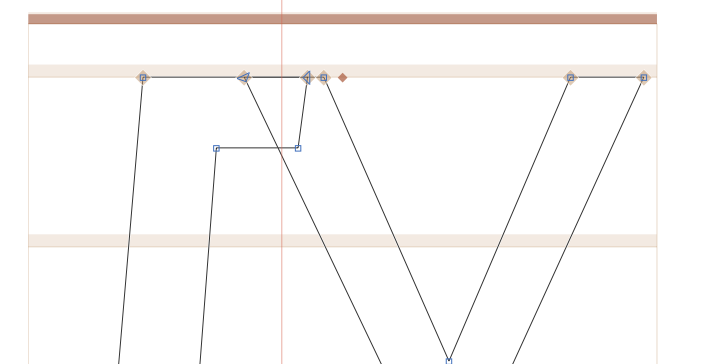
/U-cy
The main stem of this glyph has a "kink" that seems unintentional.
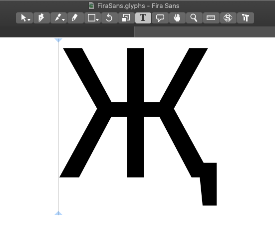
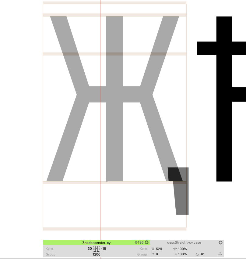
Zhedescender-cy
This has a component that isn't needed, and this juts out in the Bold master, causing an outline blip.
If we look at Fira Sans, it's clear what this shape is supposed to do:
The component was transformed to (10%, 10%) – way too small. I've adjust that to (85%, 100%) in the Bold and (100%,100%) in the light. Now it's like this:

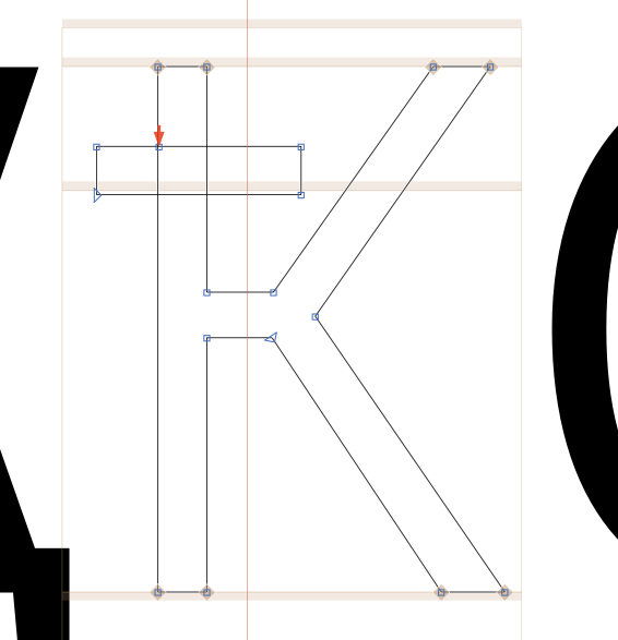
Kastroke-cy
This crossbar is overly-thick, compared to others – I'll thin it out a bit:
Kahook-cy
Before:

Now:
Lha-cy
Mismatch in upper-left:
I removed the overlap in that stroke:
be-cy
The ascender has an issue:
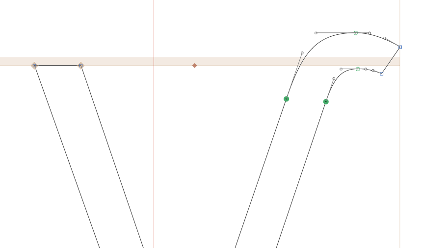
ve-cy
Inflected curve:


ze-cy
(Almost certainly) unintended curve upwards:

ii-cy
Unintended upwards-handles.

The bold looks better:

So:

komije-cy
Ouch:
Better:
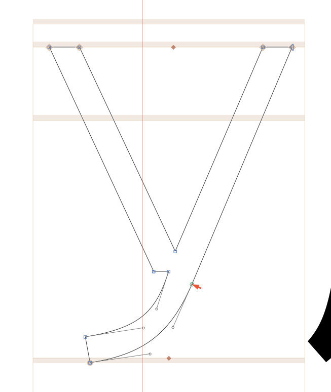
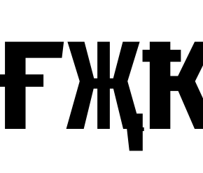
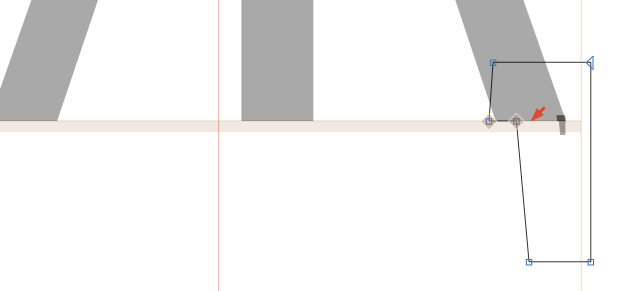
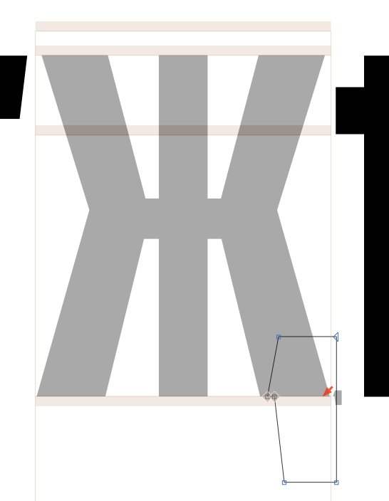
Chi
These feet aren't suppose to be angled so sharply:

In Fira Mono, you can see that the angle simply becomes less steep:

So:
kaiSymbol
Not-quite-vertical strokes:

Straightened in Bold & Reg:

betaSymbol
These lines aren't supposed to intersect:


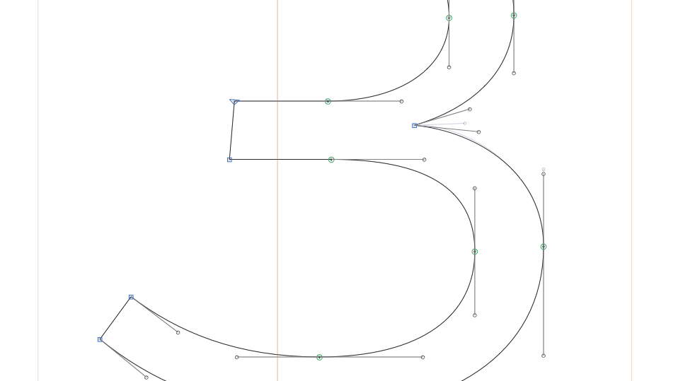
Nine
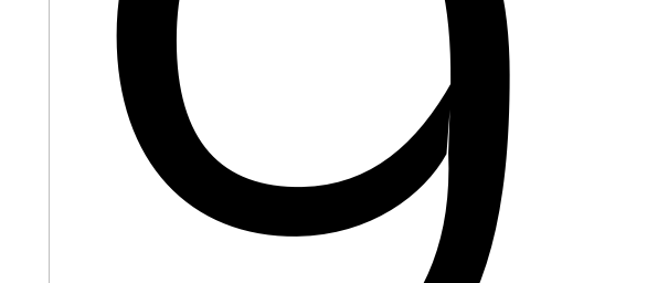

(similar problem in /nine.tosf)
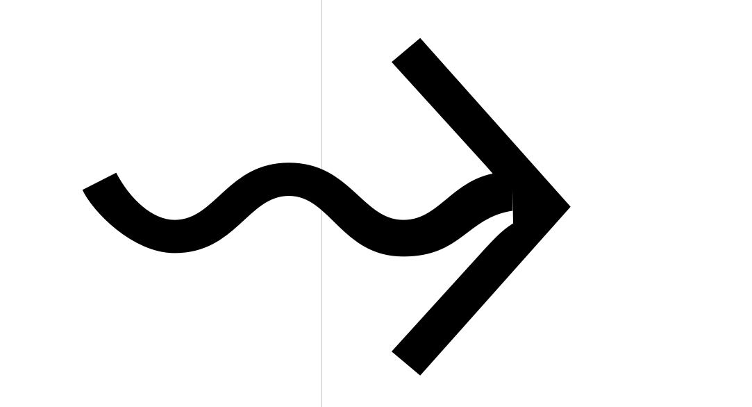
asciitilde_greater.liga
Broken connection on right side:
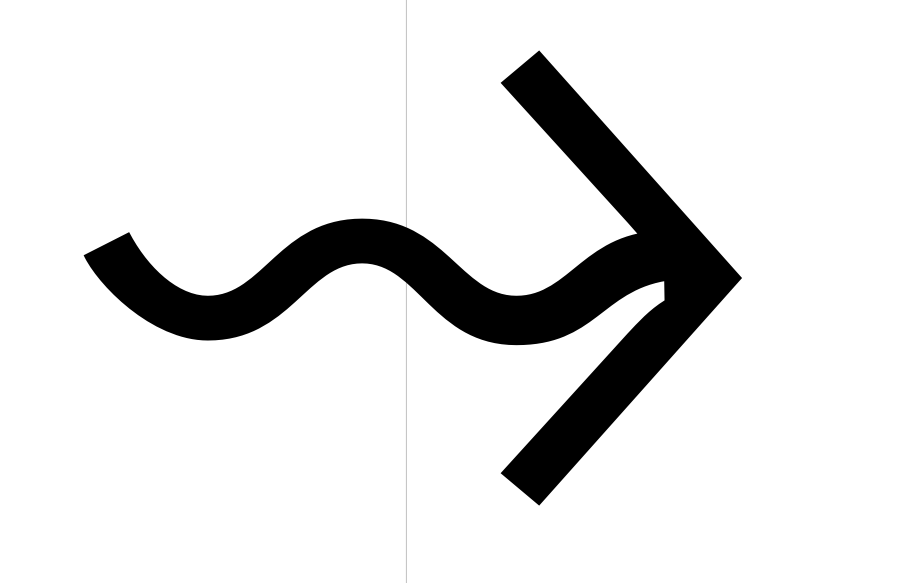
asciitilde_asciitilde_greater.liga
Broken connection on right side:
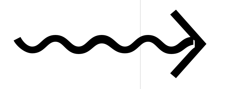
I've just scooted the curvy thing towards the arrow by a bit.

uniE0A0
Broken connection:
Fixed:

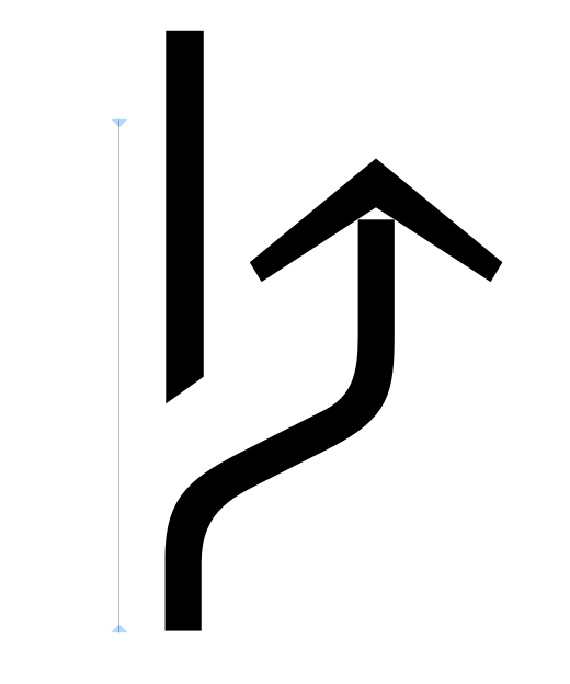
r.001
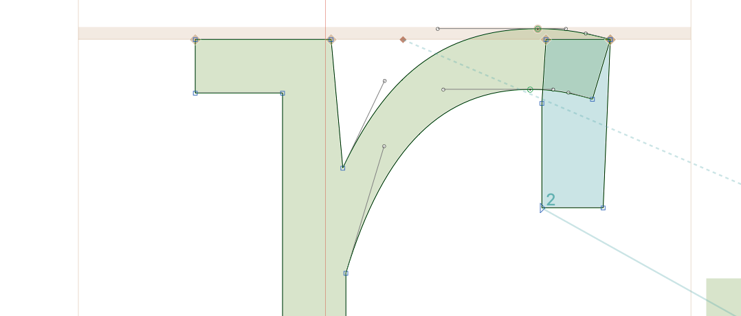

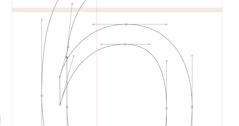
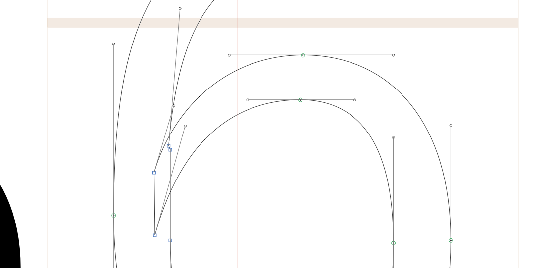
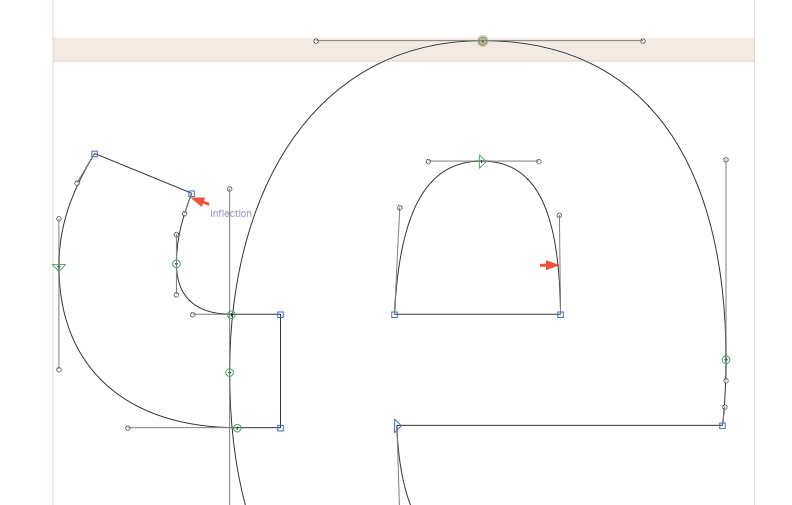
ae
This curve isn't quite continuous:
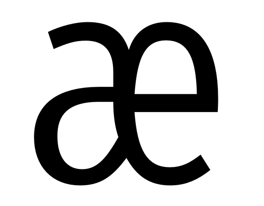
I've made it a little more graceful:
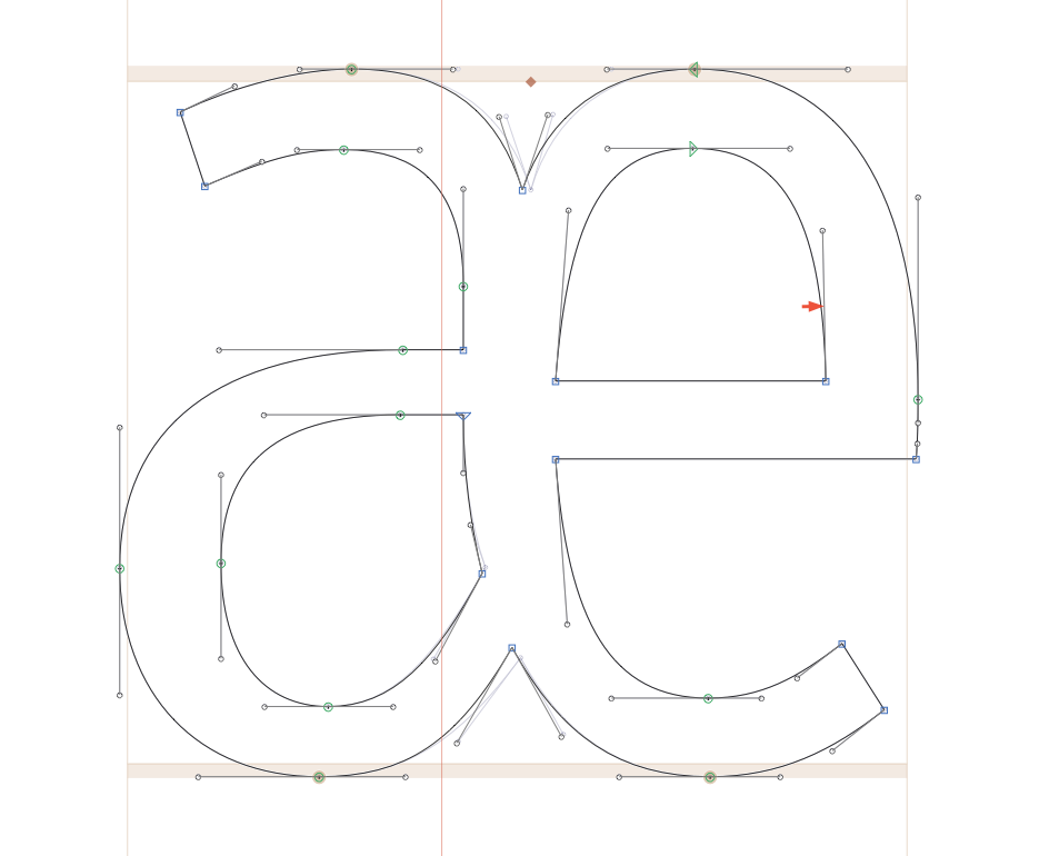

"Incorrect smooth connections" in several glyphs:
Like these slight kinks:

Should be this:
============================================================
(Small) issues I'm leaving
Often, crossbars have unnecessary points. These aren't really needed for the shapes and add a very small amount of data, but they're harmless, so I won't remove them right now.

There are many instances of overlapping shapes that, while technically fine, might not render absolutely perfectly. I'll leave these, however, as they will probably bother no one.

Small inflections, or semi-vertical handles that clearly should be that way:
Some curvy shapes have slight issues around smooth connections. I'm looking at intermediate weights to make sure there aren't huge kinks (which is a concern in angled curve points), but otherwise mostly leaving these.
